Magazine
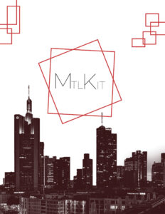
Cover for a Montreal Magazine
This project was a magazine that I worked on in a team, discussing Montreal and various points of interest around the city. The target audience is anyone who wishes to visit the city—tourists or locals who haven’t had the chance to explore it yet. We used colors like red and white because these are known to grab a client’s attention. They also match the energetic and lively vibe of Montreal. The brand’s identity is approachable and resourceful due to the numerous recommendations and information it has to offer. You can observe that I used red headings and grids to make the information and the layout of the pages interesting.


